
Such a nice way to present a gift like this…
Becky,
The books are absolutely wonderful. Bob was so surprised by all the letters and photos. I think the whole thing was a bit overwhelming for him…he’s still making his way through the letters. Also, there weren’t too many dry eyes when Bob started looking through it. Such a nice way to present a gift like this…THANKS so much to both you and Todd for all the help and assistance.
Thanks again.
Teresa
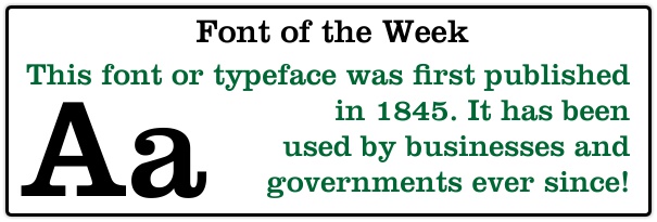


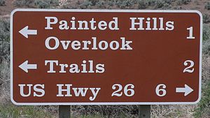 National Park service for traffic signs. Even though it is a serif font, I don’t think I would recommend it for the body of your paragraph text when printing a book. Oh, if you have not heard of Christian Brothers Automotive, they are a top quality auto repair business with franchises throughout the country. A friend of mine owns the one in Andover, MN so I thought I would give him a plug!
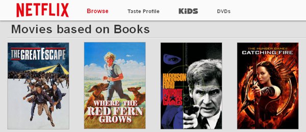 If you are like many 21st century homes in America you probably have a Netflix account. Did you ever notice the section Movies Based on Books? Why is it that movies that are created from the pages of a book tend to be better? I think it is because when you are writing a book, you can’t rely on special effects to keep your audience captivated. The plot, scenes and every character need to stand on their own. You can see the skill of the writer who can paint a picture with words that can’t be matched on the screen! I actually feel lazy when I see a good movie that was based on a book I have not read. Almost without exception, people will tell you the movie was “good” but it didn’t do justice to the book. I liked the movie The Hobbit based on the book by J.R. Tolkien, but I remember sitting down with the hard cover book late at night as a kid. Gollum was scarier in the book! Go read some classic books “my precious!”
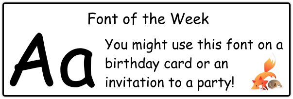 To kick off our font of the week we will start with an easy one! Many people have used this font, especially kids. The name of the font: Comic Sans. Reflecting on our last post about fonts I would guess that the “sans” refers to the fact that it is a sans serif font. While I don’t recommend this font for the body of a novel, there have been some kids and adults that have used Comic Sans for their children’s picture book stories. And of course, it has been a staple for birthday party invitations for years!
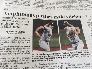 Sometimes even the big leagues get it wrong! Always make sure to read the body of the text…and the titles too! Also, have someone else take a look at the project. A new set of eyes can be a great help.
 To start off this blog about fonts for books here is an answer to a simple question: