
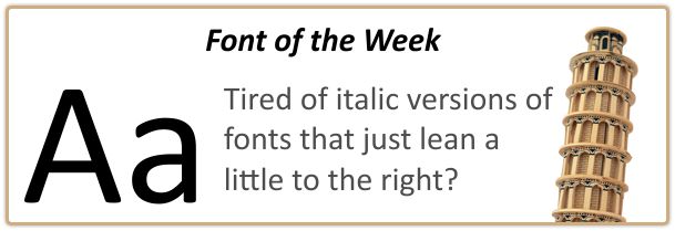
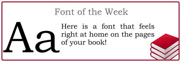
Book Printing Font of the Week – Wednesday, November 4
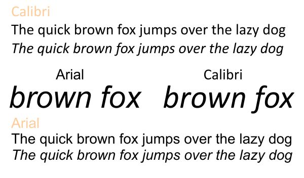
Have you ever noticed that most sans serif fonts are a little boring when you go to italicize them? The Calibri Font adds just a little more flavor to its italic version. You can see below how the Calibri font does more than just lean to the right like its boring cousin Arial. Some of the lines are slightly curved, some letters are more rounded and others are completely different. You see a drastic difference more often in serif fonts like Times Roman. Italic fonts are used for book printing text in a number of places. Italics can be used for chapter titles or subtitles in books. You can also use them for captions or when you are quoting what someone is saying or has said. Book publishing can be a fun but challenging task. Make sure you have a good set of fonts in your toolbox!


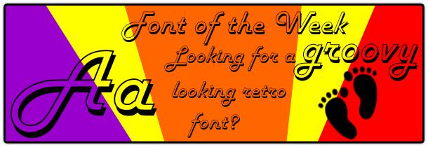

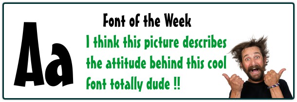
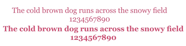
 It seems like I’ve seen a font like this on a 70’s album cover or something in that time period. If you can remember let me know! The font is called Harlow D. You would not use a font like this for the text inside a book but it might be a fun option for the book cover design depending on the type of book. I’m not your average Hippie by any means but I do enjoy some vintage 70’s art and symbols!