Book Printing Font of the Week – Wednesday, August 12

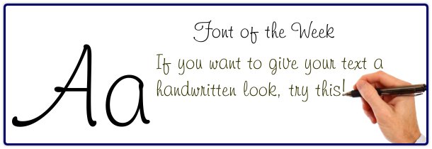
Sometimes you are looking for a specialty font. Something that you would not use as the main text of a book but to insert a quote or other text you want to look more personal or handwritten. A good font for that occasion is Freehand, Freehand 591 BT to be exact. There seems to be a few different versions on Freehand but this is my favorite. It is “cursive” looking but still informal and fun. If you really want to make a computer font look like true cursive, you can adjust the spacing on a cursive style font, making the letters closer together so they almost touch. What is Kerning? Kerning is the process of adjusting the spacing between the letters. Typically, only the more expensive page layout and graphic design programs give you this option.


