Book Blog

Book Printing Font of the Week – Wednesday, September 30

Book Publishing and Book Printing

If you are under 40 years old, you may have never even used a typewriter!  In the late 80’s, when I was in college, we had luxurious electric typewriters.  Some of them even had eraser ribbons built in!  If you didn’t have one of these you had to either cross out or use white-out to correct your mistakes.  If you wanted to insert a sentence or paragraph, no problem.  Just re-type the entire paper!  There was no spell or grammar check, you were on your own.  If you were typing your paper in the middle of the night for a class that was at 8:00 the next morning, make sure you don’t run out of typewriter ribbon.  Oh, and if you dropped your paper in a puddle on the way to class, you had to give the professor a wet smeared mess.  There was no button to reprint the paper.  I can’t imagine an author trying to write and entire novel or book using a typewriter.  Book publishing services for authors

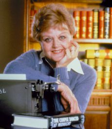
When I was in High School, we took a typing class using electric typewriters.  The kids now take a class called “Keyboarding.”  I didn’t want to be a secretary so I thought knowing how to type would be useless….boy was I wrong!  Oh, and the picture on the right is of Angela Lansbury, not me.

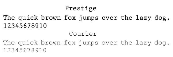
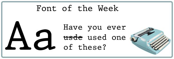
The font in the picture is called Prestige.  There are a few computer fonts that have that old “typewriter” look, another one is Courier.  In the non-digital age, if you wanted to use artistic style, you had to do it by hand!

Book Printing and Book Binding Fonts

Book Printing Font of the Week – Wednesday, September 16

Book Publishing and Book Binding

This is another alternative to Times New Roman font.  Bookman Old Style just sounds like a traditional font for printing a book.  Actually we don’t recommend using Times New Roman for book printing any more.  It is a little too commonly used for so many other text printing applications.  Sometimes it’s nice to make your pages a little more unique. Bookman Old Style has been around for over a hundred years but it still works great.

Tired of hearing about the quick brown fox?  I found a new sentence that contains all of the letters of the alphabet!

Book Printing and Binding

Book Printing and Book Binding

Book Printing Font of the Week – Wednesday, September 9

New Font for Google Logo

We have relied heavily on Google over the years to bring us search traffic from around the country.  When people search for book printing, book publishing, book printing or types of books like yearbooks or family history books we try to be as “search-friendly” as possible.  If you found us through a search, please send us a note to tell us what you typed in the search box!

I don’t always report on whatever Google is up to but this time it had to do with the font in their logo!  They went from some type of serif font to a new sans serif look.  Their blog said that they were trying to find a logo that was a little more mobile friendly.  The heavier sans serif font seems to do the trick….and of course, the missing color is GREEN.  What do you think, was it a good choice?

New Google Logo

Book Printing Font of the Week – Wednesday, September 2

Book Printing Fonts

Well, we have had fun for a few weeks and it’s time to get back to business!  Remember, if you are looking for a font for the paragraph text when publishing a book, you need to find a good serif font.  Garamond has been a classic book printing font of choice for many years.  This is another alternative to Times New Roman.  Garamond offers a familiar and professional look to your readers.  Don’t let the creativity stop when you finish writing your book!  Experiment with many different fonts, even combinations of fonts.  One font for the body of the text and another, possibly sans serif font, for headings and captions.  The combination below shows Garamond teamed up with a bold Calibri font for a heading.  I picked these two because the letters “g” and “a” were similar.

Book printing fonts